Crafting a sales page that converts is a fine art, especially when navigating the common sales page mistakes many DIY copywriters make. From linking features to benefits, to creating a compelling narrative, we'll show you how to avoid these pitfalls for a sales page that truly converts.
Why you need a sales page
- Your sales page is the main point of reference for someone who is considering investing in your offer, whether it's a membership or DFY service
- It acts as the main conversation between you and your potential buyer where you tell them everything they need to know about your offer
- Having a well-written sales page will ensure your buyers have the info they need to make an informed buying decision + help you to sell your offers on autopilot
Let's breakdown some common sales page mistakes
Mistake 1: Not tying features back to benefits
One common mistake is not tying features back to the benefits they provide. It's crucial for potential buyers to understand not just what they're getting, but why it matters. Instead of presenting a mere ingredient list of your offer, ensure every feature is linked to a tangible benefit for the buyer. Ask yourself, "So what?" For example, if your offer includes monthly group coaching calls, explain the significance. What's the point? Why should this matter to a potential buyer? It's important to spell out the value behind each feature, making it clear how it serves their needs or solves their problems.
Mistake 2: No clear value proposition
Another pivotal mistake is the absence of a clear value proposition. It's essential to articulate what sets your offer apart and why it should be the chosen solution. Reflect on the specific pain points and desires of your target audience. Try to sum it up in a single statement that summarizes the value of your offer. This is known as your unique selling proposition (USP). This USP should not only capture immediate attention but also be woven consistently throughout your messaging, reinforcing why your solution stands out in a crowded market.
Mistake 3: Underutilizing your FAQ section
A lot of people will treat their FAQ section as a place to simply reiterate details already on the sales page, like refund policy or payment plans. While it's important to be clear on these things, the FAQ section is also a great place to combat buyer objections. Reflect on what might cause a potential buyer to hesitate or what questions they might have. It's crucial to thoughtfully respond to these in the FAQ section of your sales page, turning it into a powerful tool to ease concerns and encourage the decision to purchase.
Mistake 4: Too many links on the page
Another common mistake is overwhelming your sales page with too many links. After investing effort in directing visitors to your sales page, it's counterproductive to distract them with numerous outbound links. Eliminate unnecessary elements like menu navigation, footer links, and social media buttons. Additionally, minimize or eliminate pop-ups that could divert attention away from your primary goal. Ensure that your primary call-to-action directs visitors straight to the checkout page without any detours. The only exception is to include essential links to your terms of service and privacy policy for transparency and trust-building.
Mistake 5: Lack of narrative
Reading a sales page should feel a little bit like a journey for your reader. Remember that this is all about having a conversation with them. Start by connecting with them and making them feel seen, heard, and understood, before presenting your solution and why it's the answer they've been looking for. Don't forget to close the conversation with a clear call to action that clearly states why someone should take that action NOW
ACTION STEP: If I skim-read your headlines, can I get a jist of the story you're telling about your offer?
Your sales page structure, done for you!
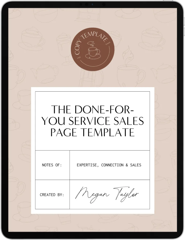
As you can see, there are a lot of considerations that must go into structuring your sales page (and considerations for what to avoid!). Want us to take all of the guesswork out of that for you? Check out our offer-specific sales page copy templates.
Our situation-specific templates strategically support your reader’s decision-making process, so they feel informed (and excited to type in their credit card details).
Looking for more copy tips?
If you’re wanting to refine your messaging and improve your copy to book more clients, check out more tips below!
Sales Page Structure Secrets: A Guide for More Conversions >
6 Effective Sales Page Templates: Why Generic Doesn’t Cut It >
How to update website content: a step-by-step guide for business owners >
Pin for later
