If I land on an opt-in page and feel bored, I'm not going to sign up. Full stop.
I mean that specific feeling you get when you read the copy and think: I've seen this a hundred times before. There's no "oh, I need that specific take." No "wait, this is going to fix that exact problem I've been stuck on." Just a shrug — and a closed tab.
That's the opt-in page that doesn't convert. And the frustrating part is, most online business owners assume the problem is with the lead magnet itself — or maybe the page design — so they end up tweaking the wrong things and wondering why nothing changes.
The fix isn't a new layout or a prettier freebie mockup. It's copy that makes one thing crystal clear: if you download this today, here's what's going to change for you. Not eventually. Not someday. By the end of today.
That's what this post covers — how to write an opt-in page that actually makes the trade feel worth it.
What Is an Opt-In Page?
An opt-in page (also called a freebie page or squeeze page) is a standalone page designed to do one thing: collect someone's email address in exchange for a free resource — usually a checklist, guide, template, or mini-course.
A "landing page" is a broader term. It describes any standalone page where someone arrives and is encouraged to take one specific action — entering their email, buying a product, booking a call, or registering for a webinar. All opt-in pages are landing pages. The term describes the structure, not the purpose.
What makes an opt-in page different from a sales page is the trade. Instead of asking for money, it's asking for an email address in exchange for something free. That changes how the copy works — it's shorter, more focused, and has one job. But it still has to sell.
Here's a quick comparison of the two:
| Opt-In Page | Sales Page | |
|---|---|---|
| Goal | Collect email address | Make a sale |
| Offer | Free resource (lead magnet) | Paid product or service |
| CTA | "Get the [freebie]" / "Send it to me" | "Buy now" / "Enroll" |
| Length | Short — 200–500 words | Long — 1,000–5,000+ words |
| Navigation | Removed | Removed |
| Trust signals needed | Moderate | High |
Why Your Opt-In Page Has to Sell the Freebie
Your email address is a trade. When someone considers signing up for your opt-in, they're weighing what they'll get against the cost of another newsletter in their inbox, more email to manage, one more subscription to think about.
The copy on your opt-in page has to make that trade feel genuinely worth it — which means it has to answer the question every reader is silently asking: what's actually in it for me?
That question is harder to answer in 2026 than it used to be. Information and education-focused freebies are going to be harder to sell than ever before, because information is no longer scarce.
If you're a copywriter sharing an e-book on best practices and formulas? Someone can find that on Google. If you're a designer and your freebie is a brand board template? There are twenty of those on Canva right now, for free. If you're a coach and you've written a generic e-book on sales? Your reader would rather open an AI tool and ask for sales ideas that are actually personalized to their business — because they'll get something better, faster.
"I can get something just as good elsewhere" is the thought that kills your conversion rate. And most opt-in pages never even try to fight it.
The freebies that still work are the ones that give people something genuinely hard to replicate: a shortcut to a specific result, a template that saves real hours, a framework built for a particular type of business or problem. And the opt-in page has to communicate that specific value — not "it's a PDF with tips" — for the trade to feel worth making.
What Every High-Converting Opt-In Page Includes
Here's what the copy needs to do, in roughly this order:
1. A headline that leads with the result, not the resource
Don't open with the format. Open with what changes. "The free guide to Instagram captions" is a format. "Write a week of Instagram captions in under an hour" is a result.
2. A subheadline that names who this is for
One or two sentences that make the reader feel understood before you pitch the freebie. Who's it for, and what problem are they stuck on right now?
Using the same example: if your headline is "Write a week of Instagram captions in under an hour," your subheadline might be something like "For coaches and service providers who know they should be posting consistently — but never quite know what to say."
3. Bullet points that describe the transformation, not the contents
Instead of listing what's inside, describe what changes after someone uses it. Take this example: instead of writing "Get my top 5 tips for taking better iPhone photos," you'd write "Learn how to take better iPhone photos of your busy kids, so you can capture those family moments on the go." Same freebie. The second version makes the reader feel something — and that's the version that converts.
4. A CTA that's specific to your freebie
"Subscribe" and "Submit" are CTAs — but they're flat, generic ones that don't make anyone want to take action. Your button copy should remind readers exactly what they're about to get: "Send me the template," "Get instant access," "Yes, I want this." (See more CTA examples here.)
5. Social proof about the freebie itself
A short line from someone who got a real result from this specific resource. Not a general testimonial about your work — something about what the freebie actually did for them.
Social proof for freebies is harder to collect than for paid products, but it's there if you look for it. Screenshot Facebook comments, Instagram DMs, or replies to your lead magnet delivery email. Even one line or a screenshot of email feedback from a new subscriber counts — you don't need a formal testimonial.
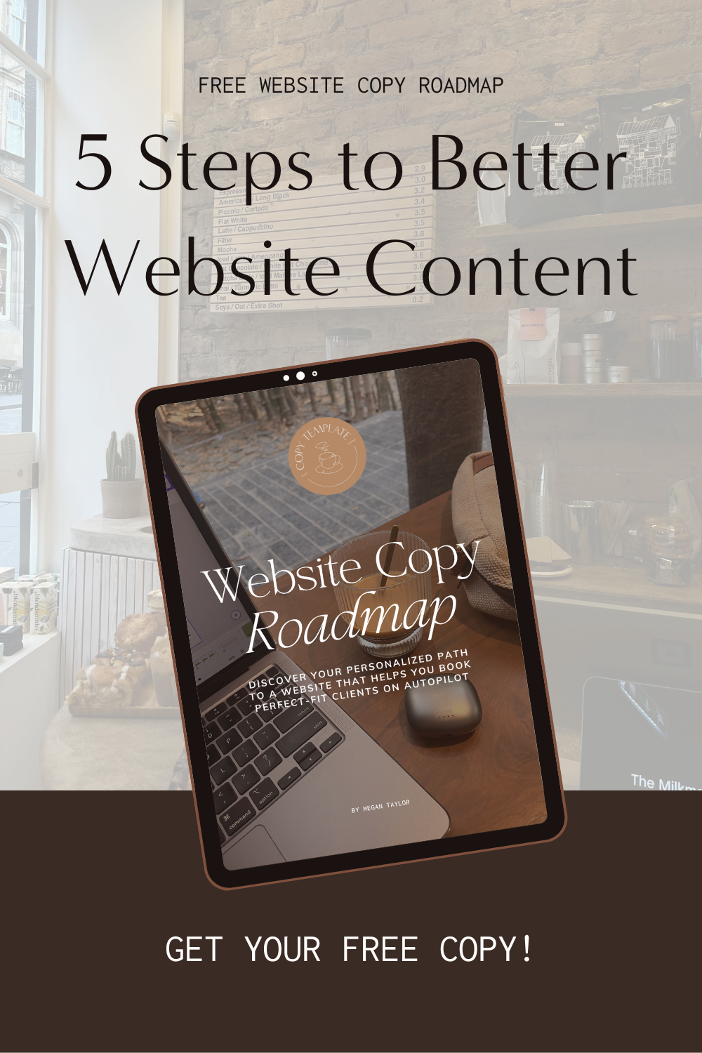
6. An image of the resource
Most lead magnets are digital, which means you need to make them feel real. A styled mockup — your workbook on a desk, your Lightroom presets shown as a before/after on a phone, your roadmap displayed on a laptop screen — helps visitors visualize what they're actually getting.
Danbee Shin does this well on her opt-in page for her Roadmap for Web Designers: she shows exactly how it will look on your laptop after downloading, which makes the resource feel tangible before you've even signed up.
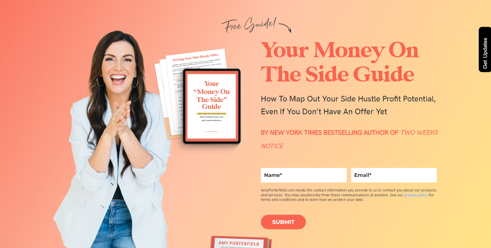
7. A form that only asks for what you need
The more fields you add, the more friction you create. In almost every case, you only need a first name and email address. That's it. Even Amy Porterfield — arguably the list-building queen of the online business space — only asks for those two things on her opt-in forms.
The Most Common Opt-In Page Mistakes
1. Listing features instead of benefits
"It's a 30-page e-book." "It's a collection of 20 Canva templates." So what? What are you actually going to get out of using those things? What are you going to learn, achieve, do? What's finally going to feel easier? How are you going to feel on the other side of using the freebie?
Those answers belong on your opt-in page just as much as they belong on a sales page.
2. Writing to everyone
The more specifically you describe who this is for, the more the right person thinks you're reading their mind. "For service providers who hate writing" will outperform "for anyone who wants to write better" every time.
3. Burying the lead
If the first thing on your opt-in page is a paragraph explaining what a lead magnet is, you've already lost them. Lead with the result. The context can come later — if it needs to come at all.
4. Trying to explain too much
An opt-in page is short by design. If you're writing 800 words to convince someone to take something free, something else has gone wrong — either the freebie isn't compelling enough, or the copy isn't doing its job.
5. Leaving your navigation menu on the page
Your opt-in page should have no navigation. No header menu, no footer links, no sidebar. The only thing a visitor should be able to do is sign up or close the tab — anything else gives them an excuse to click away before they convert.
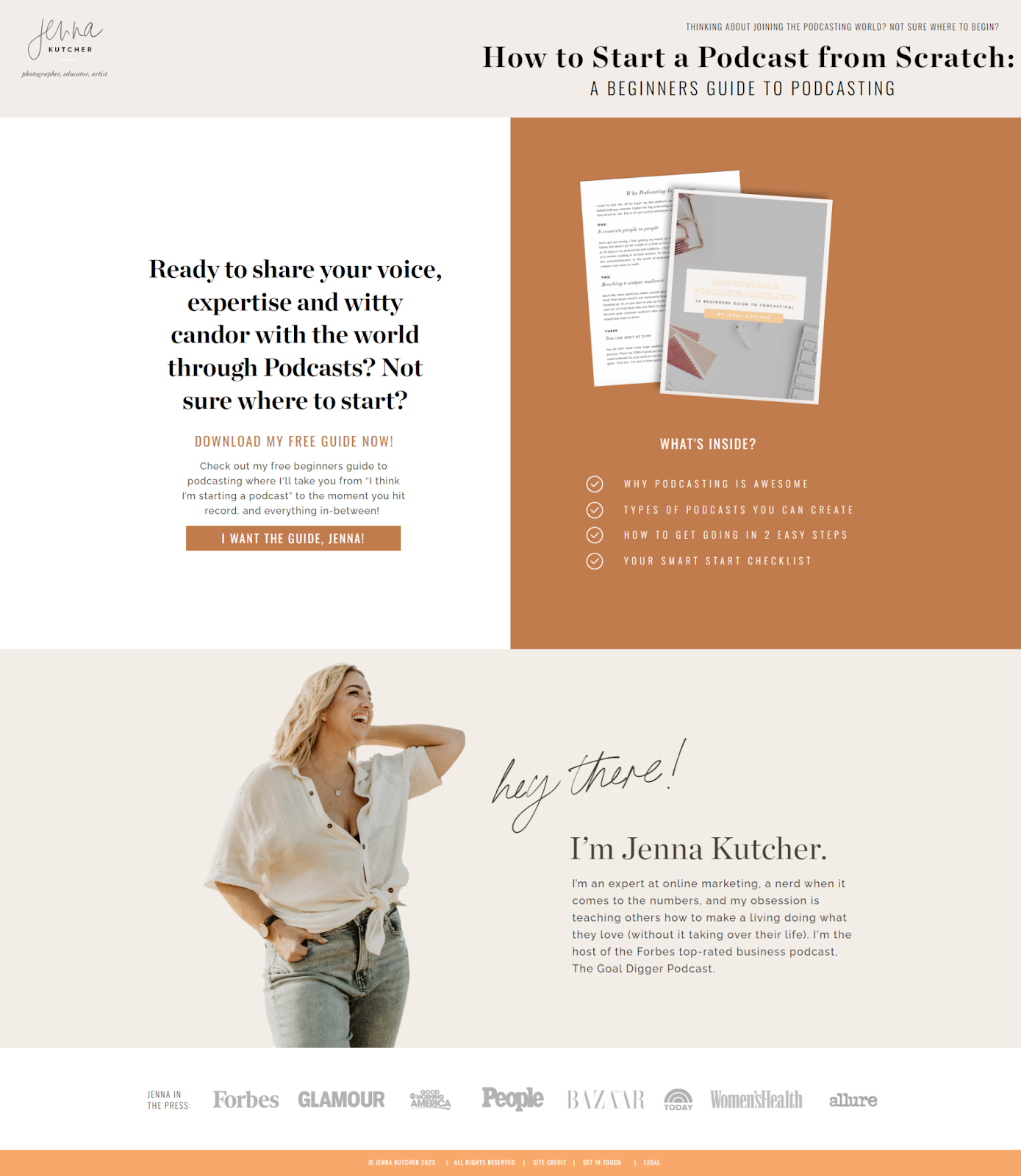
Jenna Kutcher's opt-in page for her Beginners Guide to Podcasting is a great example of this done right. Even though she has a huge library of courses, blog posts, and podcast episodes, the navigation disappears completely on her opt-in page. The only goal is the download.
6. Sending cold traffic to a page built for warm audiences
This is one of the biggest mistakes people make before running ad campaigns — and it's completely fixable.
A warm audience already trusts you. They follow you, read your content, know what you do. So when they land on your opt-in page, they don't need much convincing. But when you drive cold traffic from Facebook ads, Pinterest, or a collaboration partner's audience, that same page often underperforms dramatically.
Cold traffic doesn't know you yet. They need trust signals that your warm audience takes for granted. That means adding a short bio that establishes who you are and why you're the right person to learn from. It means including testimonials — not just about the freebie, but about you and your work. If you've been featured in publications, podcasts, or media, a logo banner is a quick, visual way to signal authority to someone who's never heard of you.
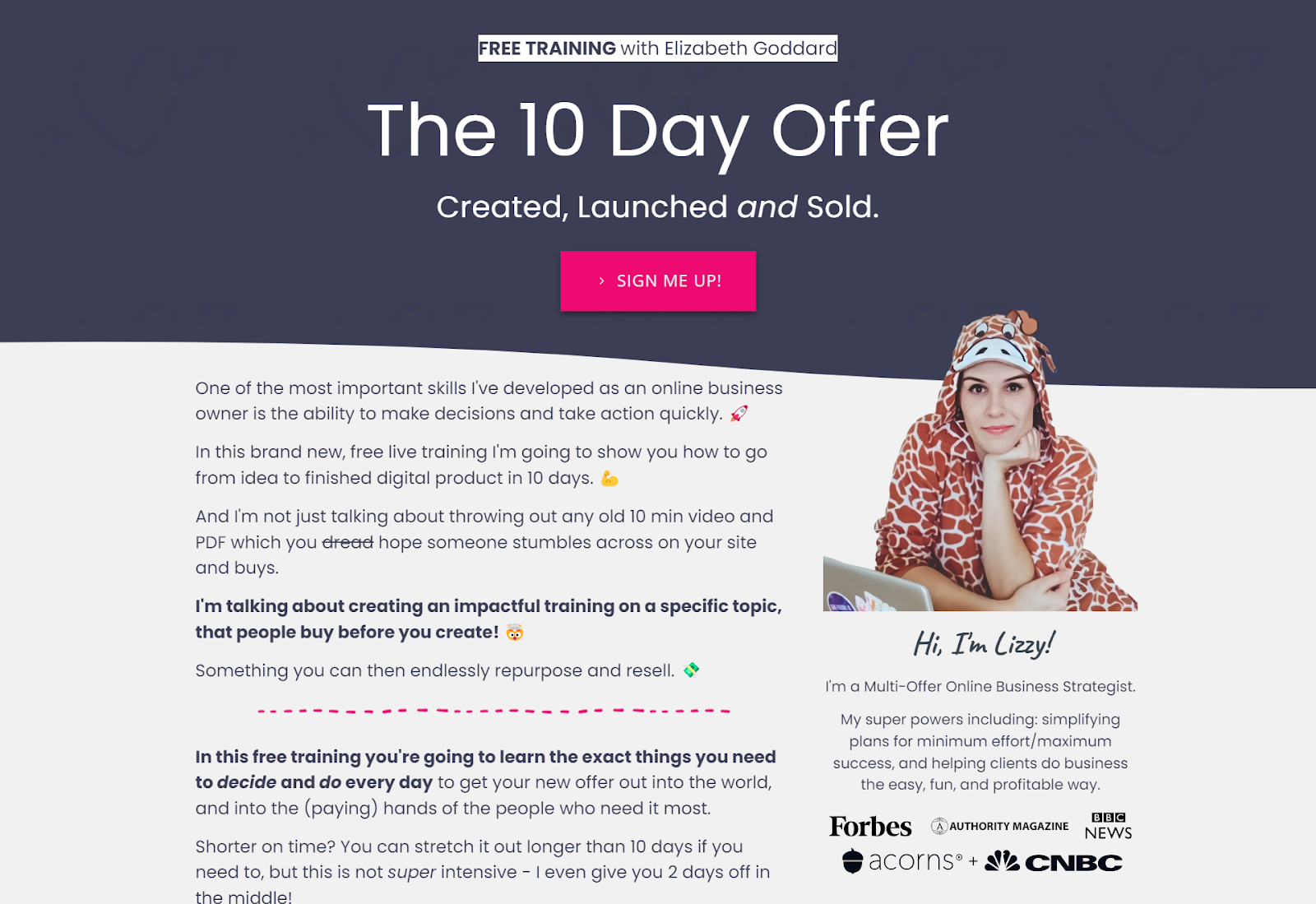
Elizabeth Goddard is a great example of this in practice: she uses media feature logos directly on her opt-in pages, which signals credibility immediately to a cold visitor who has no existing relationship with her brand.
The rule of thumb: never assume that because a page is converting well for a warm audience, it'll work the same for cold traffic. They're different audiences with different levels of trust, and your page needs to reflect that.
How to Write Opt-In Page Copy, Step by Step
Step 1: Answer "so what?"
Before you write a single word of copy, you need to be able to answer this question: you created this freebie — so what?
You made it for your reasons. You want to grow your email list. You want leads before your next launch. That's your purpose. But what's in it for the person downloading it? Why should they take the next five minutes — or the next hour — to go through it? What is that going to mean for their business? How is their life going to feel easier on the other side?
Your entire opt-in page is founded on the answer to that question. If you can't answer it clearly, the copy won't work — because there's nothing to build on.
Step 2: Write a headline from the result
Take your "so what?" answer and turn it into a headline. Lead with the transformation, not the tool. Test a few variations before committing — the headline carries the most weight of any element on the page. (For help with this, read the guide to writing headline copy.)
Step 3: Write the subheadline
Who is this for, and what problem does it solve? If someone lands cold with no context, will they immediately know whether this is for them? Write one to two sentences that name the audience and acknowledge where they're stuck.
Step 4: Write two or three bullet points about the transformation
Each bullet finishes the sentence: "After using this, you'll ___." Short, specific, parallel in structure. Focus on what changes, not what's inside.
Step 5: Write the CTA
Match it to the action and the offer. First-person if possible ("Send me the guide"). Short and specific beats generic every time.
Step 6: Add social proof
Pull from your DMs, emails, or comments — wherever you have real feedback about this specific resource. One real sentence, or a screenshot of a subscriber reply, beats a wall of generic praise.
Step 7: Read it out loud
This final check isn't about editing for polish — it's about honesty. Ask yourself:
- Does this sound right when you read it out loud?
- Is it written in your voice, or does it sound like a more formal, stiff version of you?
- Are you bored reading it? Because if you are, they will be too.
- Is this an accurate portrayal of what the freebie actually does?
- Would you say any of this out loud to someone in real life to get them excited about your lead magnet?
If the answer to any of those is no, that's your edit.
Want the Copy Written for You?
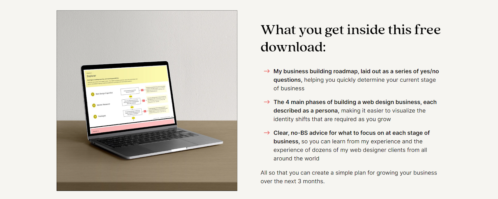
If you'd rather fill in the blanks than figure out the structure, the Opt-In Landing Page Copy Template gives you the exact framework to write a high-converting opt-in page in an afternoon — without staring at a blank page.
It includes the headline formula, transformation bullet framework, CTA options, and social proof placement. You just fill it in.
Frequently Asked Questions
How long should an opt-in page be?
Short. Most high-converting opt-in pages are 150–400 words. You're asking someone to take something free, not spend money. If you're writing more than 500 words to make the case, look at whether the copy is doing its job — or whether the freebie offer isn't compelling enough yet.
Do I need a dedicated opt-in page, or can I just use a popup?
Both work, but a dedicated page gives you more room to communicate the value of the freebie — especially useful when you're driving cold traffic. Popups work well for warm audiences already on your site who just need a nudge.
What's the difference between an opt-in page and a landing page?
All opt-in pages are landing pages, but not all landing pages are opt-in pages. A landing page is any standalone page built around a single goal — that goal could be collecting an email, making a sale, booking a call, or registering for an event. An opt-in page is one specific type: it trades a free resource for an email address.
What's a good opt-in page conversion rate?
For warm audiences, 30–50% is a solid benchmark. For cold traffic (ads, Pinterest), 15–25% is good. Under 10% and it's worth looking at the headline and CTA first — those two elements do most of the work.
What should go on the thank-you page after someone opts in?
Thank them, confirm what's coming, and give them one clear next step. That might be following you somewhere, browsing your shop, or joining your community. Don't leave it blank — it's the warmest moment in the whole relationship. For ideas on what to say next, read the guide to building an email nurture sequence.
Writing website copy is one of those things that feels simple until you're staring at a blank page. If you want a done-for-you structure, the Opt-In Landing Page Copy Template gives you the fill-in-the-blanks framework to write your opt-in page without the guesswork.